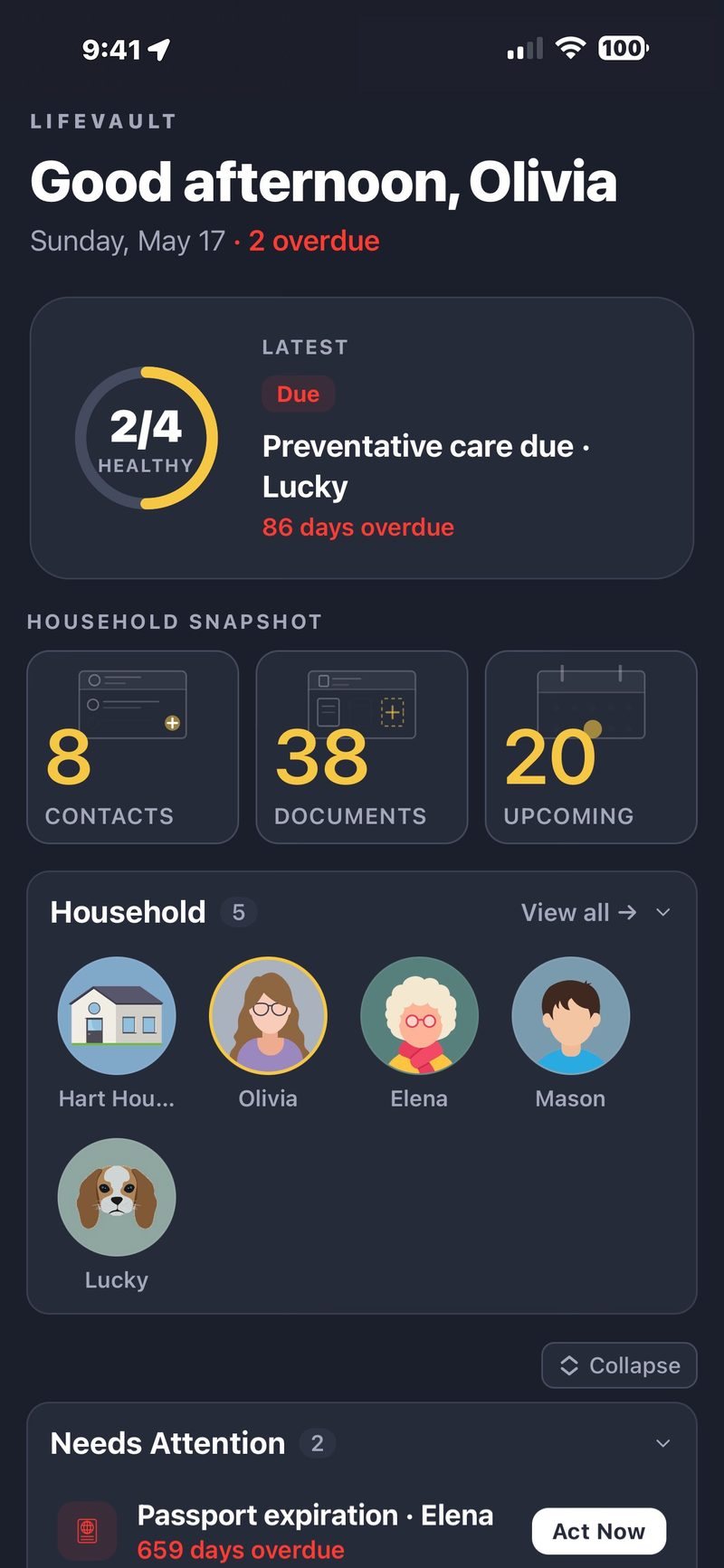
LifeVault is a privacy-first mobile app that keeps a family's records, documents, and emergency information in one structured, searchable place. I designed and built it end to end — the research, the information architecture, the interface, and the React Native front end. This is how it came together, and the decisions behind it.
Policy numbers, a pet's vaccination record, a parent's medication list, the passport that expires next month. This information lives scattered across email, filing cabinets, screenshots, and memory. It works fine until the moment you actually need it.
And that moment is usually the worst possible time to go looking: a hospital intake, a claim after a break-in, a school form due today, a border crossing. The information exists somewhere. The problem is retrieval, not storage.
LifeVault is built for that moment. Not as a document dump, but as a structured system where the thing you need is where you would expect it to be.
I kept hitting the same wall in my own life: I was the person in my household who knew where everything was, which meant everything routed through me. That is a bad single point of failure for the exact information a family needs when someone is unavailable.
I am a developer first and a product designer second. That shapes how I work. Instead of describing an idea and waiting to validate it, I could build a rough version and feel whether it held up. A lot of LifeVault's design was decided by using it, not by specifying it.
The product is not the storage. The product is being able to find the right thing at the wrong time.
The primary user is the person who already carries the household's information in their head. Often a parent or a caregiver. They are not looking for a productivity toy. They want somewhere trustworthy to put things down and get them back quickly.
Just as important is who it is not for. This is not an enterprise records system or a shared team drive. It is one person organizing a household, and that focus drove nearly every decision.
This was lightweight, honest research rather than a formal study. I looked at how people actually store this information today: the Notes app, physical binders, shared spreadsheets, a folder of camera-roll screenshots. I talked with a few caregivers about what they reach for and when. I read reviews of adjacent apps to see where they lost people.
A handful of insights shaped everything downstream:
The spine of the app matches how people actually think. Profiles (people and pets) are the top-level unit. Each profile holds records, grouped into categories like identification, medical, insurance, travel, and legal. Documents are a cross-cutting library, searchable on their own and linkable to the records they belong to.
Underneath, there are dozens of distinct record types. The design challenge was never showing that many choices at once. Categories collapse the space first, so you choose a lane, then a type, and you are never staring at a wall of options.
The most consequential decision was refusing to hand-design a screen for every record type. Instead, each type is described by a field definition, and a shared set of field renderers turns that definition into a real form. Text, dates, selects, toggles, lists, linked documents, and contacts all render through the same system.
This kept every record consistent, made new types cheap to add, and meant a design change propagated everywhere at once. The same model quietly handles the edge cases: some records are one-per-profile, others are lists, and both flow through the same pipeline.
Capture and edit happen in bottom sheets that stay within thumb reach. Multi-select uses category pills rather than nested menus. Destructive actions like delete require a deliberate swipe and a confirmation, because this is exactly the data you do not want to lose by accident.
The dashboard does the quiet work: it surfaces what needs attention and what is expiring soon, so the app can tell you something is coming before you have to remember to check.
The single biggest barrier in research was the perceived effort of entering data. So the capture flow leans on the camera. Point it at a document and LifeVault pulls the key details, like dates, policy numbers, and providers, and drops them into the right fields. You review what it caught, fix anything it missed, and save.
The recognition itself runs on the platform's on-device text recognition (Apple Vision and ML Kit). I did not build those engines. What I designed and built is the layer on top: mapping raw recognized text into structured fields, and the review step that keeps a person in control of what gets saved.
Every screen is built on a single design system with a shared type scale, spacing, and component set. Light and dark are not two designs. They are the same structure and hierarchy, fully themed, so nothing shifts meaning between them. The product carries a calm gold-on-charcoal identity that stays out of the way of the content.


That framing sets the accessibility bar. Labels sit above their inputs, never hidden inside them as placeholder text. Touch targets are sized for imprecise taps. Contrast holds up in both light and dark. Text respects the system size settings so people who scale their type up are not fighting the layout.
To be honest about the state of it: accessibility here is an ongoing commitment, not a finished audit. A formal pass, especially deeper screen-reader testing, is on the list below.
LifeVault is local-first. Data lives on the device, with sensitive values in secure storage, and the schema is versioned so the app can migrate older data forward as it evolves. There is no cloud backend. That is a deliberate privacy choice, and it removes options a server would give you: no cross-device sync, no server-side search, no remote backup out of the box.
The app is React Native, Expo, and TypeScript, one codebase targeting iOS and Android. Designing against on-device limits, rather than a backend I did not build, kept the scope honest and the promise to users real.
There is no translation gap between a design file and the code, because they are the same thing. The field renderers, the record registry, and the form definitions are both the design abstractions and the implementation. When I add a record type, I add a definition, and the shared renderers handle the rest.
A normalization layer keeps data in one consistent shape across the whole app, so display, editing, and export all read from the same structure. This is the part where being a developer first paid off: the system is coherent because it never had to survive a handoff.
AI tooling was part of the build. I used it to scaffold repetitive code, refactor and split large files, and quickly explore alternative approaches before committing to one. It compressed the mechanical work so I could spend more time on the judgment calls.
What it did not do was decide the product. The architecture, the interaction choices, the trade-offs, and the taste were mine. AI is a fast collaborator on the parts that are labor, and the design direction still has to come from a person who knows what good looks like here.
LifeVault is on the App Store today. What it does in its shipped form:
The app is free on the App Store, and there is more about the product at lifevaultapp.com.